If I wanted to make a quilt with a fused fabric Dexter on it, the faux HDR pic would give me a great start to trace on a light box. It seems to limit or separate the photo into fewer distinct colors, which is a necessary step in fused fabric applique. Other than that, I prefer the original version. Captures his intensity. Carol
While darkening the original or touching up the contrast a little bit might really be nice, this style really over-contrasted in my opinion. Parts of definition in the picture are lost.
If you could find a balance in between it might look good, however. I'm as much an editing snob as a photography bloke, I s'pose. xD Still, it's a great capture either way.
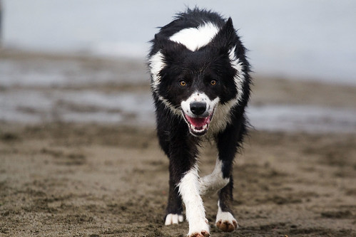
If I wanted to make a quilt with a fused fabric Dexter on it, the faux HDR pic would give me a great start to trace on a light box. It seems to limit or separate the photo into fewer distinct colors, which is a necessary step in fused fabric applique. Other than that, I prefer the original version. Captures his intensity.
ReplyDeleteCarol
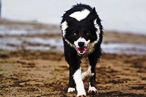
Randy in Tampa Bay: looks too busy.Original looks like Dexter is coming back to you out of a misty background.
ReplyDeleteTo photo - scary!
ReplyDeleteYep. Scary!!
ReplyDeleteWhile darkening the original or touching up the contrast a little bit might really be nice, this style really over-contrasted in my opinion. Parts of definition in the picture are lost.
ReplyDeleteIf you could find a balance in between it might look good, however. I'm as much an editing snob as a photography bloke, I s'pose. xD Still, it's a great capture either way.
In the original version, Dexter seems more the center of focus. In the adjusted photo, you loose that. He doesn't pop out at you as much.
ReplyDeleteI agree -- he looks kinda scary in the top picture!
ReplyDeleteI have no idea what HDR is or what it is for. That said, I like the original a lot better.
ReplyDelete